


 My goals and intention with this piece were to create a distorted image by looking in a christmas ornament. I accomplished this by using a bright pink color that i then layered with charcoal. I was surprised to see how well the distorted hand came out. It was most difficult to draw from life and pick out the lights and darks. I met this challenge by changing the lighting. I experienced right brain shift by really looking at the size and placement of the image. I think my drawing really works in its movement. I learned that detail isn't everything. I can bring in working on colored paper as i really liked how it turned out. I learned from zoe as her drawing looking like space even though she was in the auditorium and I really like that. If I had a do-over, I would be less sketchy with all my lines. I think the best thing about this piece is the movement it evokes.
 My goals and intentions for this artwork were to see the lights and darks in my own facial features instead of looking at "an eye as an eye." I accomplished this by starting with the light of my brow bone and then filling in the eye and basing everything of that eye. I was surprised with my ability to do the hair. It was difficult to base things off the eye since I made it so large. I met this challenge my measures the other facial features with a pencil. I experienced left to right brain shift by looking at the shapes and turning the photo upsides down while doing the sketch. I think my drawing really works in the mouth and nose area. I learned to not be afraid to do hair and can now incorporate that into my next pieces. I learned from Jess because although her drawing was not necessarily realistic, It still had her look and was a really cool piece of art. If I had a do-over, I would base more things off the nose and mouth like i did for the david sketch so my eye wouldn't be so disproportional. I think the best many of my artwork is the mouth.


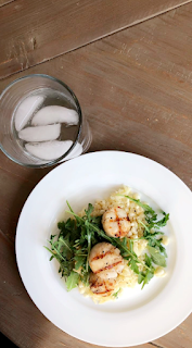 Food is something that brings my family together. My mom has made homemade meals and we have had family dinners since I was born.
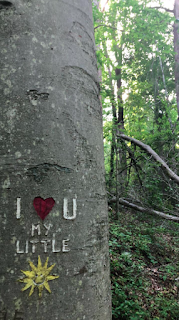 This photo represents family to me because I found this carving while on a hike, which is one of my dad's favorite hobbies. This picture is also special to me because my mom always sings the song "You Are My Sunshine" to me and my sister.
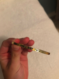
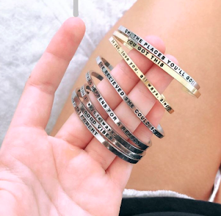 My mom gave me this bracelet on the first day of high school and continues to give me similar ones with different sayings/quotes for special dates in my life.
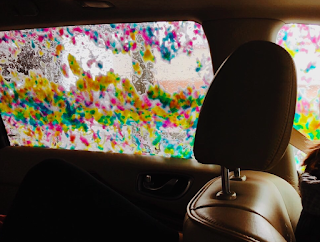 I find family in this picture because every since I was little, my mom liked to take my sister and I to the car wash and we always wanted to get the rainbow soap.
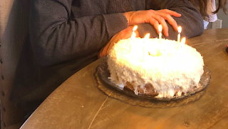 This picture, taken on my dad's birthday, features his favorite coconut cake that we make for him every year.