Wednesday, October 31, 2018

Charcoal Skull: Final Project and Artist Statement


Artist statement:
My goals and intentions with this piece were to carve out the light and dark shadows. I accomplished this by looking at the shadows as shapes. My painting's main focus is the large gaping eye hole and also the texture and color differences in the skull vs the pumpkin. The most difficult challenge I had to face was doing the teeth and looking at them as individual shapes that are all different. I met the challenge by using a piece of looseleaf paper and seeing how the teeth do not form a perfect straight line. I think my painting uses negative space to its advantage and it looks like the skull and pumpkin morph into the darkness. I learned how to look as the anatomy of a skull and forget what I am drawing and I think this will help me when we eventually begin to do faces. We learned from Jamie Wyeth and his pumpkin paintings and especially the way he used light. I liked Zoe's work because she had so much contrast in it. If I had a do-over, I would spend more time focusing on the pumpkin. I really liked my skull and I was proud of it but I wish I could just cut out the pumpkin and have the main focus be the skull.

Wednesday, October 17, 2018

Joy Final Paintings: Artist Statement

Joy through Fashion


My goals and intentions with these pieces of artwork were to portray different fabrics and fashions to show others my love for clothing. To achieve my goals, I chose photos that had an interesting sleeve and arm placement. I was surprised to use purples and oranges to create the perfect brown and how layering the colors made everything pop more. The most difficult challenge was figuring out to make a light color but still making the color be saturated. I used yellow mainly to achieve the light spots in my work. I experienced the shift to right brain thinking by looking at the shapes in the fabric and outlining those shapes I found. A dull pencil makes a dull drawing. When it doubt, blend it out. Draw the shapes. My drawing works together in the colors I used and in the fabric placement of each sleeve and arm. I also used a contrasting blue to make the clothing pop. I learned how to use water color pencils and I liked them because they helped blend my colors together while still being able to see my mark on the work. I really liked Jess's work because her style was so different than mine. I loved how block-y it was and the high intensity colors made it pop which is something I struggle with. If i had a do-over, I would start with a base color. For example, for the red dress I would color the entire thing a light red and then go back in with highlights and shadows. I think the best thing about my work is the use of different colors and layering I used to make shadows.


Sunday, October 14, 2018

JPG Challenge 3: Family

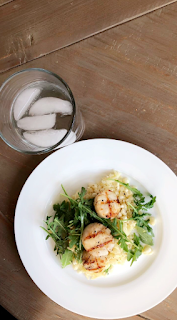
 Food is something that brings my family together. My mom has made homemade meals and we have had family dinners since I was born.

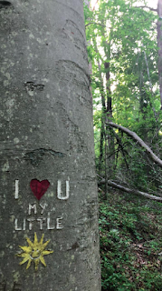
 This photo represents family to me because I found this carving while on a hike, which is one of my dad's favorite hobbies. This picture is also special to me because my mom always sings the song "You Are My Sunshine" to me and my sister.

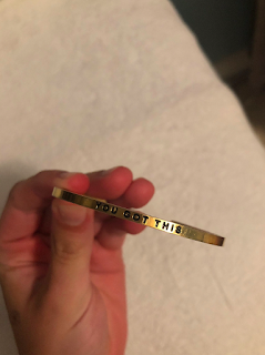
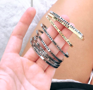
 My mom gave me this bracelet on the first day of high school and continues to give me similar ones with different sayings/quotes for special dates in my life.

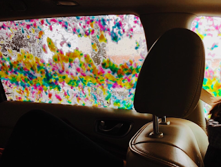
 I find family in this picture because every since I was little, my mom liked to take my sister and I to the car wash and we always wanted to get the rainbow soap.
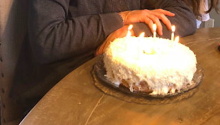
 This picture, taken on my dad's birthday, features his favorite coconut cake that we make for him every year.

Hand and Cake Prints